

450 years of potential
Before William Shakespeare had written his first sonnet, Felsted was teaching children to read, write and create. It’s one of only a handful of schools that can claim an historic 450 year milestone, and remains as prevalent now as it was then. An independent school based in the South East of England, Felsted welcomes children aged 4-18 and consists of primary, pre-prep, preparatory, senior and sixth form schools.
What sets Felsted apart from other independent schools is that it’s not an academic hothouse institution. Instead, they prefer to offer an educational experience that is warm, welcoming and inclusive, encouraging each individual child to reach their potential.
An opportunity for change
This needed to be reflected in the Felsted brand, which had become diluted in recent years. Having worked closely with them before on other projects, they got in touch and invited us in to present our ideas.
The brief was to simplify the school’s visual identity, create a suite of prospectus brochures and write and create a guidelines document to assist with the implementation of the ‘new look’. We knew we could deliver on this front, but realised there was a much bigger story to tell. We conducted a brand workshop with key project stakeholders including both headmasters, the marketing manager and school governor. This served to help us better understand their brand purpose and values, as well as uncover key areas for potential change.
Rising to the challenge
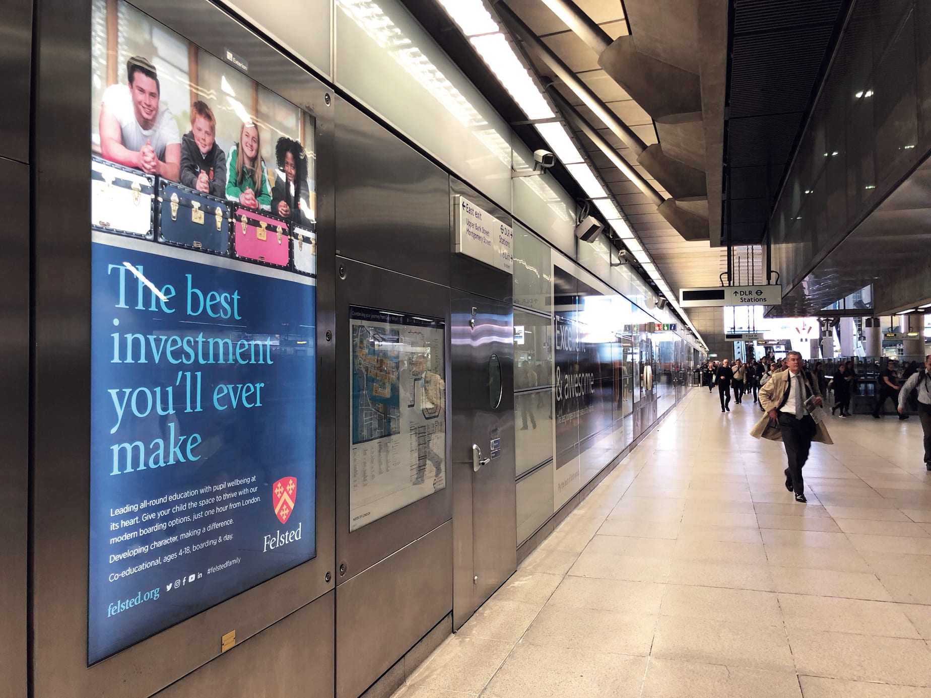
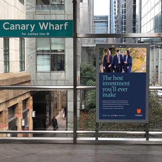
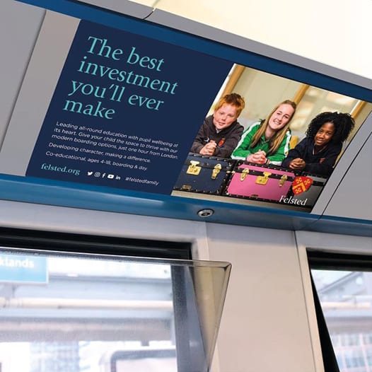
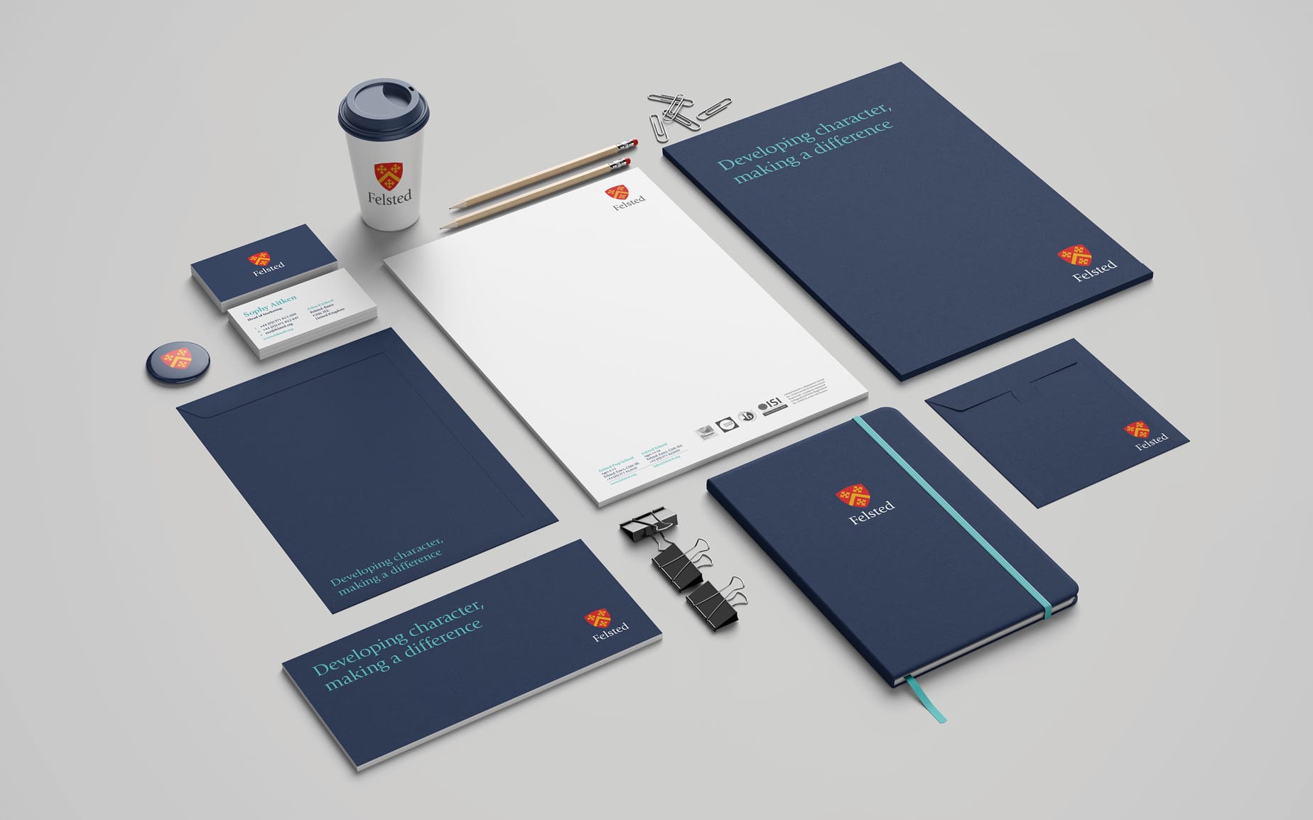
Every year, Felsted produce a variety of marketing and promotional materials ranging from print brochures to sports apparel. Using different suppliers for different departments posed a unique challenge when it came to brand consistency, and several different versions of the Felsted logo were in use across the collateral. This diluted the power of the brand and served up an inconsistent and unsatisfactory brand experience for parents, teachers and students.
We were also concerned that the ‘busy’ colour palette may limit the clarity we wanted to communicate as part of the new brand identity – a bold approach was needed.
Many hearts, one voice
For Felsted to achieve its true potential, we had to challenge their historic beliefs regarding their brand. While their heritage is something they should exhibit with pride, we didn’t want it to hold the brand back visually, and needed to apply contemporary insight based on the things we’d learnt from stakeholders.
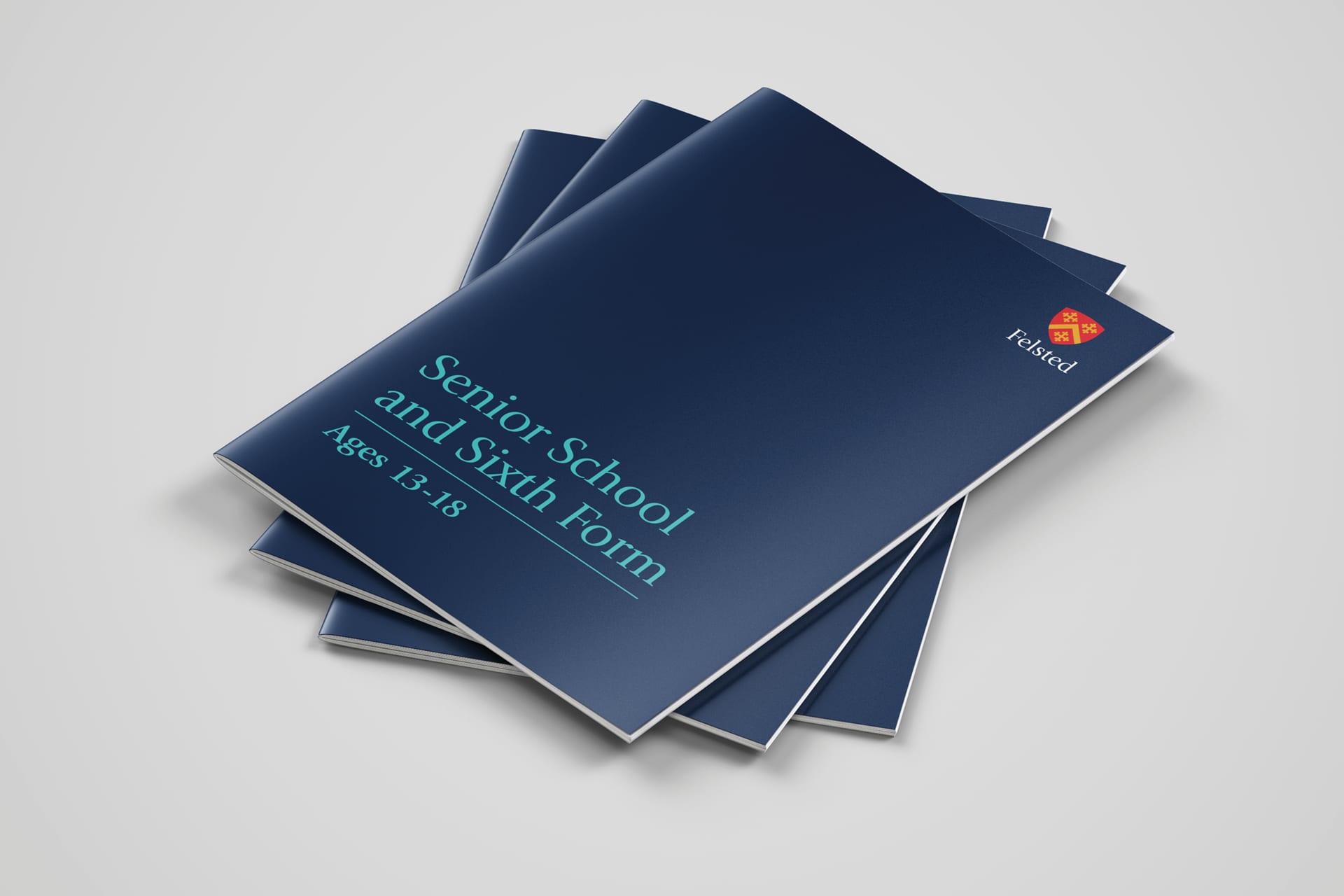
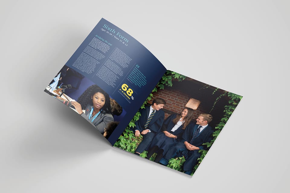
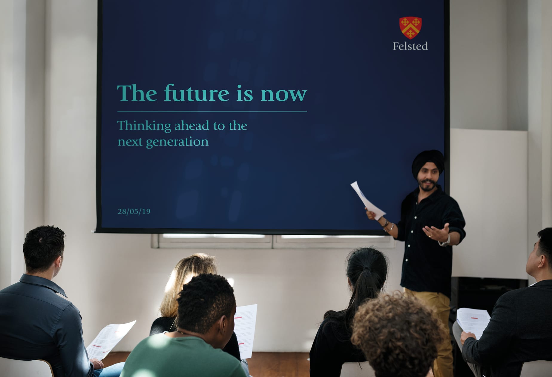
We simplified and streamlined the logo design down to one master version that could be implemented across all marketing media. We also rationalised the sub division logos and introduced a common style, championing the use of a single school brand colour – Felsted Navy – across the school.
Make it personal
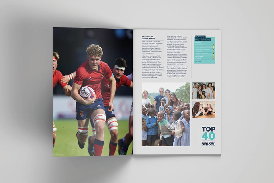
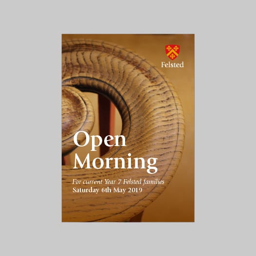
With the colour palette developed, we then delivered a personalised prospectus software solution that married seamlessly with their brand purpose, all the while improving marketing productivity and lowering print costs. A digital workflow system was introduced, designed to print and mail ‘one off’ marketing pieces that consisted of an A4 folder, covering letter and tailored prospectus brochure.
This would bring Felsted closer to their core audience while also allowing them to reach prospective parents and students in a more personalised way.
The proof
Felsted’s new identity was launched on the 1st September 2017 and has been received extremely well by all stakeholders. The school now produces on-brand digital and print based marketing collateral both in-house and via external agencies with the help of their new brand guidelines and prospectus software solution. The all-new, personalised prospectus brochures have also been incredibly well received by parents:
“We would very much like to thank Felsted for the recent admissions pack. It was wonderful and the personalisation was a fantastic attention to detail which made it extra special.”